How Productivity Dashboards Revolutionize Your Workflow
Imagine having a crystal ball that tells you what's happening in your work life right now and helps you anticipate roadblocks before they appear. That's essentially what a productivity dashboard achieves. By consolidating your performance metrics into a single, interactive interface, these dashboards are indispensable tools for modern productivity. Whether you're managing personal goals or coordinating a global team, productivity dashboards offer real-time insights and tools to optimize how you work.
What Exactly Is a Productivity Dashboard?
A productivity dashboard is your command center for tracking, analyzing, and visualizing performance metrics. It transforms raw data into meaningful insights, pulling information from various tools like Google Calendar, Trello, and Asana, and presenting everything in a streamlined, visual format. From colorful Gantt charts to heatmaps, these dashboards help users spot trends, identify bottlenecks, and make smarter decisions, all in real time.
Key Features That Make Productivity Dashboards Stand Out
What sets productivity dashboards apart is their ability to cater to diverse needs, whether you're an individual managing daily tasks or a corporation tracking large-scale KPIs. Here are some standout features:
Data Visualization That Speaks Volumes
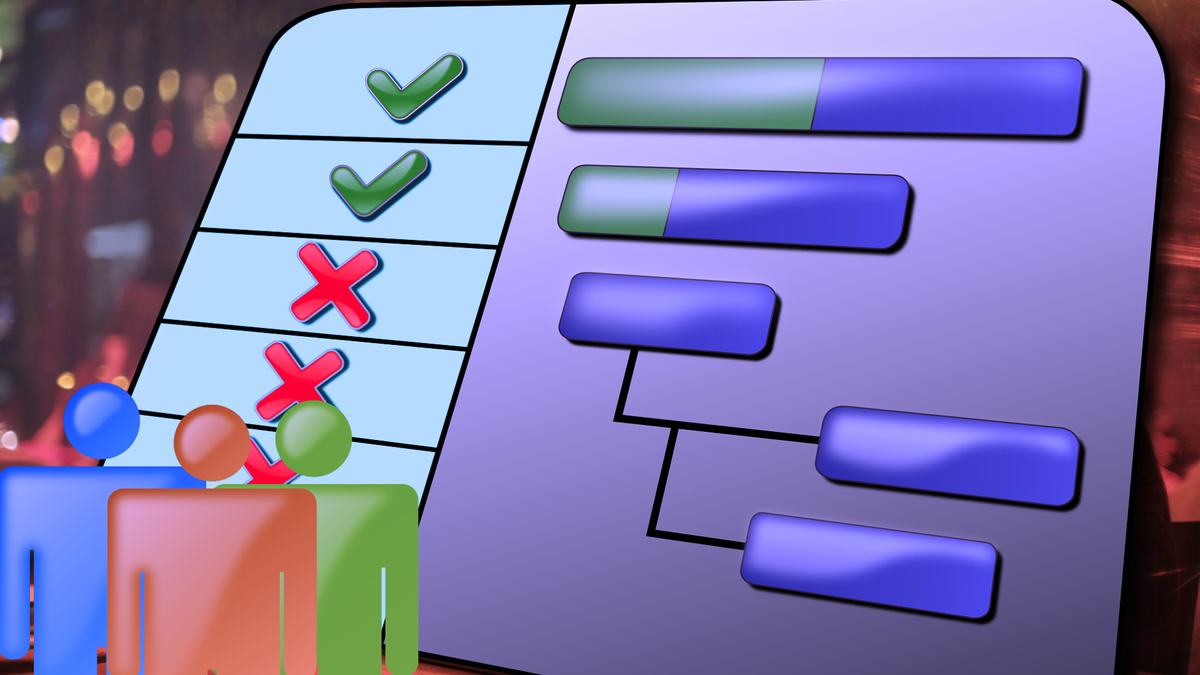
Imagine trying to decode a 100-row spreadsheet. Overwhelming, right? Dashboards simplify this with visual aids like bar charts, scatter plots, and interactive graphs. For instance, a Gantt chart can help you track project timelines, while color-coded heatmaps highlight areas needing attention. For a truly enhanced productivity experience, explore tools like the Achievement Dashboard by Conqur. It provides a clear summary of your progress and helps you stay motivated toward your targets.
Seamless Integration With Your Favorite Tools
Why juggle multiple apps when your dashboard can do it all? Many productivity dashboards integrate with popular tools like Slack, Google Calendar, and Trello. This ensures all your data is in one place, making it easier to manage deadlines, meetings, and milestones.
Customizability for Every User
No two users are the same, and neither are their dashboards. Whether you're a data enthusiast who loves detailed metrics or a minimalist who just needs the big picture, productivity dashboards can be tailored to your preferences. Features like interactive filters and personalized layouts make this possible.
The Benefits of Using Productivity Dashboards
Why are organizations and individuals turning to productivity dashboards in droves? Because they deliver results. Here's how:
Real-Time Insights for Better Decision-Making
Unlike static spreadsheets, dashboards provide live updates. For example, a retail manager can use sales data to adjust inventory levels on the fly, avoiding overstocking or shortages. Real-time insights make you proactive rather than reactive.
Boosting Accountability and Motivation
When performance metrics are visible to everyone, accountability becomes second nature. Teams can tie these metrics to tangible incentives like bonuses or recognition, fostering a culture of achievement.
Streamlined Resource Allocation
Dashboards make resource management a breeze. Managers can track who's overworked and redistribute tasks accordingly, ensuring everyone stays productive without burning out.
Common Challenges and How to Overcome Them
While productivity dashboards are game-changers, they aren't without challenges. Here's how to address them:
Data Overload
A cluttered dashboard can overwhelm users. The solution? Focus on essential metrics that drive action. Before adding a data point, ask yourself, “Does this help me make a decision?”
Low User Adoption
Some people resist new tools. To win them over, ensure the dashboard is user-friendly and integrates with tools they already use. A little training goes a long way too!
Inaccurate Data
Bad data equals bad decisions. Regularly audit your data sources to ensure accuracy. Implementing automated updates can also help maintain consistency.
Designing Your Ideal Productivity Dashboard
Creating an effective dashboard isn't just about throwing in every chart and graph you can think of. It's about balance and usability. Here are some best practices:
Know Your Audience
Are you designing for a team of data analysts or a group of creatives? Tailor your dashboard to their needs and expertise levels.
Keep It Simple
Less is more. Avoid clutter by prioritizing the most critical metrics and using clear, concise visuals.
Test and Refine
Before rolling out your dashboard, test it with real users. Gather feedback and make improvements to ensure it meets everyone's needs.
Future Trends in Productivity Dashboards
Productivity dashboards continue to evolve with advancements in technology. Here's what's on the horizon:
AI-Powered Insights
Imagine a dashboard that not only shows you what's happening but also offers actionable recommendations. AI-driven dashboards are making this a reality by providing predictive and prescriptive analytics.
Real-Time Collaboration
Dashboards are becoming collaborative spaces where teams can share insights, leave comments, and tag each other for follow-ups, all within the platform.
Industry-Specific Customizations
From healthcare to retail, dashboards are being tailored to meet the unique needs of different industries, making them even more effective.
Final Thoughts
Productivity dashboards are more than just fancy charts and graphs; they're your roadmap to success. By offering real-time insights, fostering collaboration, and simplifying decision-making, these tools are transforming how we work. Whether you're an individual aiming to crush your goals or a leader steering an entire organization, a productivity dashboard is your secret weapon for staying ahead in today's fast-paced world.
Ready to level up your productivity? Click here to get started today.